Human-computer interaction graduate student at Rochester Institute of
Technology.
Interested in UX research with experience in conducting interviews,
surveys, heuristic evaluations, usability testing and
qualitative/quantitative analysis. Seeking opportunities to improve
inquiry and result interpretation skills.
Asking the right questions is not easy, but it is worth striving
towards in the pursuit of understanding.
Front-end developer with experience utilizing HTML, CSS, JavaScript
and React, version control using Git, familiar with Python, PHP and
unit testing. Seeking to improve problem-solving skills with
consideration for accessibility, performance and security.
About the Website's Design
The inspiration for the design of this website comes from a resource
frequently used in ideation, qualitative analysis and planning (to
mention a few use-cases), particularly in the field of UX:
the board.
Be it physical or virtual, hung up on a wall,
placed on a table or actually just the wall or table, the value
of this shared space that fosters collaborative idea generation is
undeniable. As such, it felt fitting to present my experiences as
tidbits of ideas.
The Logo
In working towards a personal brand, I had previously developed a
quick logo based on my initials, which was then revamped following a
discussion with classmates on logo design and the application of the
golden ratio.
The first phase involved updating the colors scheme to ensure a good
amount of contrast among selected colors, which would also serve as
theme colors for the site. The final version was developed using the
golden ratio, maintaining the general idea for layers and placement
from the original.
This original logo comprises the four letters of my initials
arranged in a manner that their respective shapes complement one
another e.g. the horizontal line on a capital "A" coming from the
other letters and the letter "M" fitting part of it into part of the
"K".
A light green and blue were the foundation of the
color scheme as they are my favorite colors.
The original logo was updated to better define the curves and lines
for a smoother finish, and improve on the positioning of the
letters.
The color scheme was refined for a better
balance among colors, utilizing
coolors.co to conveniently generate
and save the scheme.
The final logo was designed utilizing square and circular guides
whose dimensions were based on the golden ratio. Once a couple of
these guides were created, the logo was put together
letter-by-letter.
Different-sized guides were combined to inform the curvature and
proportions of spirals and lines that a letter comprised. These are
highlighted in white on the diagram. I fiddled around with placement
and implied shapes (an "M" appears to be missing but is actually
within the lower half of the "K") until the logo felt just right.
These logos were designed using Inkscape.
The Elements
Earth, wind, fire and air: as there are smaller units that comprise our physical reality, so are there key design elements to this website. Based upon items commonly used on boards, these were identified as the following: pins, tape, polaroids, sticky notes and sticky flags.
Coursework Projects
The following is a sample of projects completed as part of coursework in web development and interaction design. More projects and details to come.
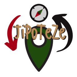
Website Project: "Jipoteze"
The following project entailed setting up a website on a place of choice, which included the following elements: a map with clickable pins and location categories, use of JSON to load website data, some animation if possible and a responsive design.
UX Project: "RITfluent"
The following group project entailed identifying a problem within the RIT community space and gathering the required data to produce a prototype of our team's proposed solution.
Website Project: Online Resume
The following project entailed setting up a multi-page website with a brief summary of my professional experience, hobbies, educational background and a resume page with printing-friendly styling.
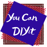
Website Project: "You Can DIY It"
The following project entailed setting up a multi-page website on a topic of choice and with its own custom logo.